
8 Common Mistakes to Avoid in Financial App Onboarding

In this article
Related articles
Guest Author: Sandy Martinuk, Sr. Director, Strategy & Innovation at Unosquare
There’s no question that a poor onboarding experience will impact the performance of your business. In fact, according to User Guiding, 75% of users are likely to abandon a product if they struggle to understand it in the first week. And, 89% of customers who have a bad experience during onboarding will turn to a competitor.
Why does this matter in affiliate marketing? In affiliate marketing partners are paid on a cost-per-acquisition (CPA) or cost-per-lead (CPL) basis. If consumers don’t convert, partners don’t get paid. Because of this, one of the first things publishers scrutinize is the application process. If consumers struggle with the application or find the app difficult to navigate post-application, they are unlikely to make deposits, resulting in lost revenue for both the publisher and the financial institution.
Given the importance of a user-friendly onboarding process, we asked one of our design and development partners – Unosquare – to talk to our team. In his recent presentation, Sandy Martinuk, Sr. Director, Strategy & Innovation at Unosquare, reviewed several fintech applications and identified eight mistakes financial services companies make that negatively impact customer onboarding.
Before reviewing these 8 mistakes, Sandy underscored the importance of understanding users. Since individuals who need to manage their finances span a wide age range, from 18 to 118, it is crucial to understand how they might interact with your application. This understanding should account for varying factors such as age, technical proficiency levels, the device they use (desktop or mobile), and diverse cognitive or sensory abilities. With that said, here are eight mistakes Sandy reviewed.
1. Misdirecting Attention
When it comes to financial applications, there are a number of ways you can misdirect user attention, including complex navigation, visual overload, overuse of gamification, and poorly communicated security features. In particular, complex navigation and excessive visuals can frustrate and overwhelm users, while gamification and biased personalization may encourage risky financial behavior.
While not necessarily misdirecting attention, financial applications also often lack a clear, primary call to action. For example, many financial apps have several choices from business to personal to credit card, before you even log in.
When working with publishers such as Forbes and Business Insider, it is important that consumers have an easy and seamless experience. To limit distraction and increase conversion, make sure you have a simple, uncluttered application and a primary CTA that lines up with the user’s goals.
2. Making Comparisons
The second mistake banks and financial institutions make is when it comes to comparing products. For example, this website has six tabs you have to choose from with unclear names (such as everyday account vs unlimited or saving). In addition, once you choose a tab, you are left with a lengthy table with small font to read.
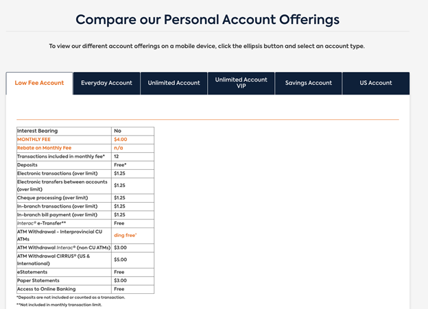
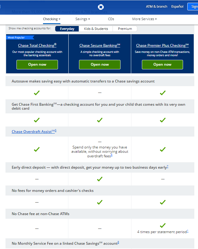
Instead, Martinuk recommends using clear tabular comparisons instead of hidden tabs to help users make informed decisions. Publishers know that if they link to a page on the bank’s or credit union’s website that has confusing messaging that the high intent consumers, they are sending to that page will not convert. See the following example from Chase Bank of best practice.
3. Surprise Onboarding Requirements
Surprise onboarding requirements can drive user frustration and increase abandonment rates. When users encounter unexpected requests for additional documentation or verification steps after they have already started the onboarding process, they can feel blindsided and frustrated. This may lead to higher drop-off rates, as users are less likely to complete the registration process if it becomes more complex and time-consuming.
The following is an example of requests for personal information. While this might be necessary, the “let’s get personal” headline does not make the user feel better about what you are asking for and / or why you need this information.
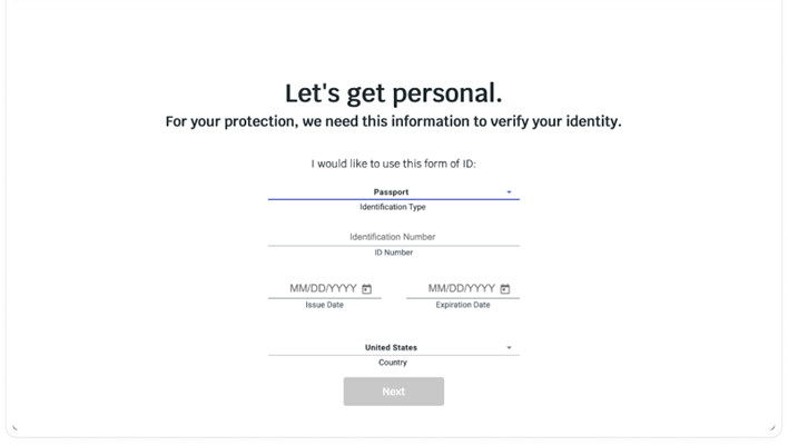
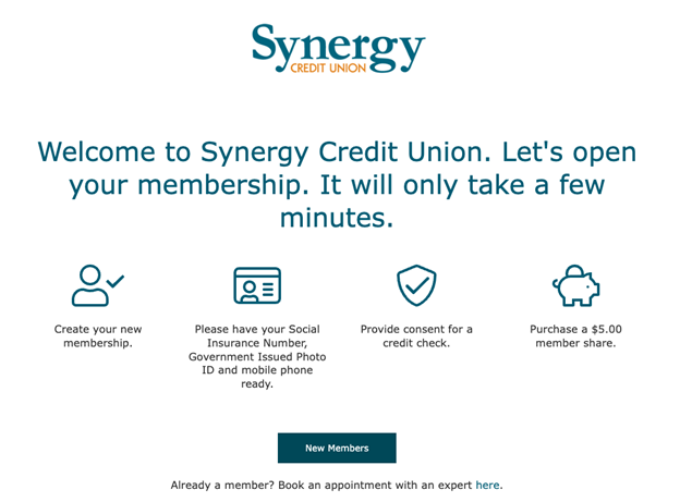
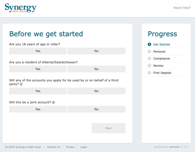
So how do you steer clear of this? Martinuk recommends two simple tips: 1) Avoid unexpected steps in the onboarding process as each step reduces completion rates, and 2) Inform users upfront about the necessary requirements so they are not taken by surprise. For example, Synergy Credit Union does a nice job of clearly telling the user what is coming up and how long it will take. By making these changes you will see a huge improvement in your new customer conversions not just for the affiliate channel but for your overall digital marketing.
4. Application Design
Users are unlikely to trust their sensitive financial information to an app that looks shady or unprofessional. Ensuring that the application design conveys trust, security, and competence is crucial; otherwise, potential users may abandon the app before even trying its features. A polished, professional aesthetic reassures users that their data is secure, and the app is reliable.
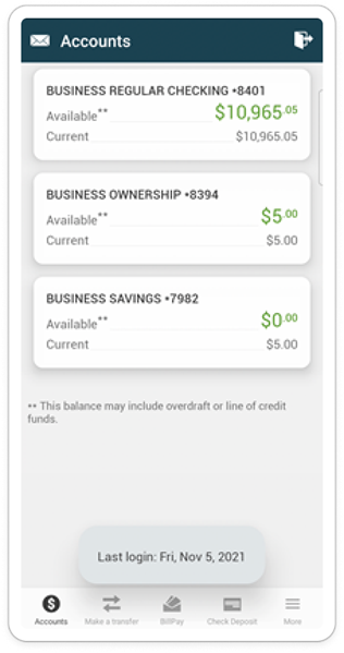
For example, while the following application immediately appears blurry and may show necessary balances, there is no branding to indicate which financial organization this is for. When designing your application, avoid generic or unprofessional aesthetics and be sure app design conveys trust, security, and competence. When working with publisher partners they pay attention to this and often will not work with a financial institution if the design does not look . For example, if the app has dark patterns and buttons that are not clickable, or if the app appears blurry like the image below, it does not appear to be reliable.
5. Lack of Signposts
Users need clear indicators of their progress to stay engaged to complete setup. By providing a visible progress tracker (or signposts), users can see how much they have completed and what steps remain, reducing uncertainty and frustration. You’ll also want to offer the user the option to save progress and resume later, thereby reducing drop-off and enhancing the overall user experience. These measures contribute to a smoother onboarding process and ultimately lead to higher conversion rates. The below user flow, for example, shows the five steps and where the user is in the process.
6. Distracting Upsells
A study by Baymard Institute found that 49% of users abandon a checkout process because of unexpected costs, distractions, and upsells. When users encounter distracting upsells, it disrupts their focus and creates friction, which can result in frustration and abandonment of the process altogether. Instead, Martinuk recommends helping the user focus on completing onboarding before introducing upsells. If done well, upsells can increase revenue, but when introduced prematurely, they may lower completion rates.
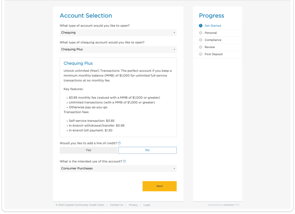
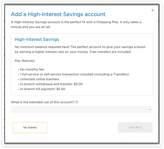
For example, in the screenshot below from a credit union, you can see that a user is trying to complete signing up for a checking account. Before they even finish, they are asked if they would like a high yield savings account.
7. Poor Security Enforcement
The integration of biometrics and secure password practices are crucial for enhancing security and user trust. According to a report by Juniper Research, the use of biometric authentication can reduce abandonment rates by up to 70% during the onboarding process. Biometrics streamline the authentication process, making it quicker and more user-friendly.
Enforcing strong password requirements and avoiding insecure password options also ensures that users create robust credentials that are less vulnerable to hacking attempts. These security measures not only protect sensitive financial data but also reassure users of the application’s commitment to safeguarding their information, thereby fostering trust and encouraging higher conversion rates.
8. App Functionality Issues
And the number one issue: your financial application needs to WORK! This sounds obvious, but you would be surprised at the number of reviews we have read where users are trying to actually deposit funds and can’t even give you money. Be sure to monitor your application and customer feedback to uncover times when your application is falling short.

Conclusion
As a successful financial app onboarding hinges on a seamless, transparent, and secure user experience. Implementing any type of digital marketing including affiliates, it is important that you build a solid onboarding process for consumers. By avoiding these common mistakes, financial institutions can improve user satisfaction, increase conversion rates as well as ensure good ROI on marketing spend.
About Unosquare
Unosquare, a leader in digital engineering and design, offers comprehensive services in financial services and fintech. With over 1,000 professionals across multiple global centers, Unosquare excels in delivering tailored digital design, engineering resources, complete development teams, and managed services to our clients.
Visit the Unosquare website to see examples of Unosquare’s work in fintech and financial services. If you would like a review of your financial application, contact Unosquare.

 English
  Français